The Workback
ART DIRECTION, BRANDING, WEB DESIGN
The Workback
The Workback is a premier business magazine featuring original reporting, analysis, and interviews with fresh and bold insights on the new era of work. Geared toward enterprise executives, this publication explores the future of leadership by surfacing ideas that inspire the world’s most forward-thinking organizations, leaders, and teams.
In my role as Brand Designer at Asana, I was the creative owner of The Workback, crafting the visual identity and design system. The result is a look and feel of the reimagined company blog that evokes the credibility of traditional business magazines with the modern elegance of innovative brands.
Featured in Typewolf, MaxiBestOf, Land-book, and Curated Design
Hillary Chin – art direction and design lead
Roger Hensley – art direction and brand design
Jordan Bogash, Hannah Minn, Hoi Chan – illustration
Chean Wei Law – creative direction
Nick Lucchesi – executive editor
Underground Digital – development and IA
THE BRIEF
Reimagine Asana’s blog into an editorial-style magazine for senior leaders interested in the science of collaboration and the future of work. The goal was to build credibility beyond product marketing, earn attention like a real publication, and attract a new audience for Asana.
Goals
Bring value to Asana that can been viewed as three discrete components:
Win the category: Become a sought-after thought leader with critical insights.
Build awareness about Asana: Publish at a consistent cadence to foster growth potential
Differentiate Asana: Launch a dramatic design renovation
This project laddered up to the company FY23 goal of building brand awareness and attracting knowledge workers who are using outdated tools to do work.
Metrics
Asana’s blog traffic had stagnated YOY. User growth was at 2%, new user growth at 4%, and sessions (every visit to the site) went down 2%.
While these numbers were low, it signaled a massive, timely opportunity for Asana to seize our position as a market leader before the competition does.
Approach
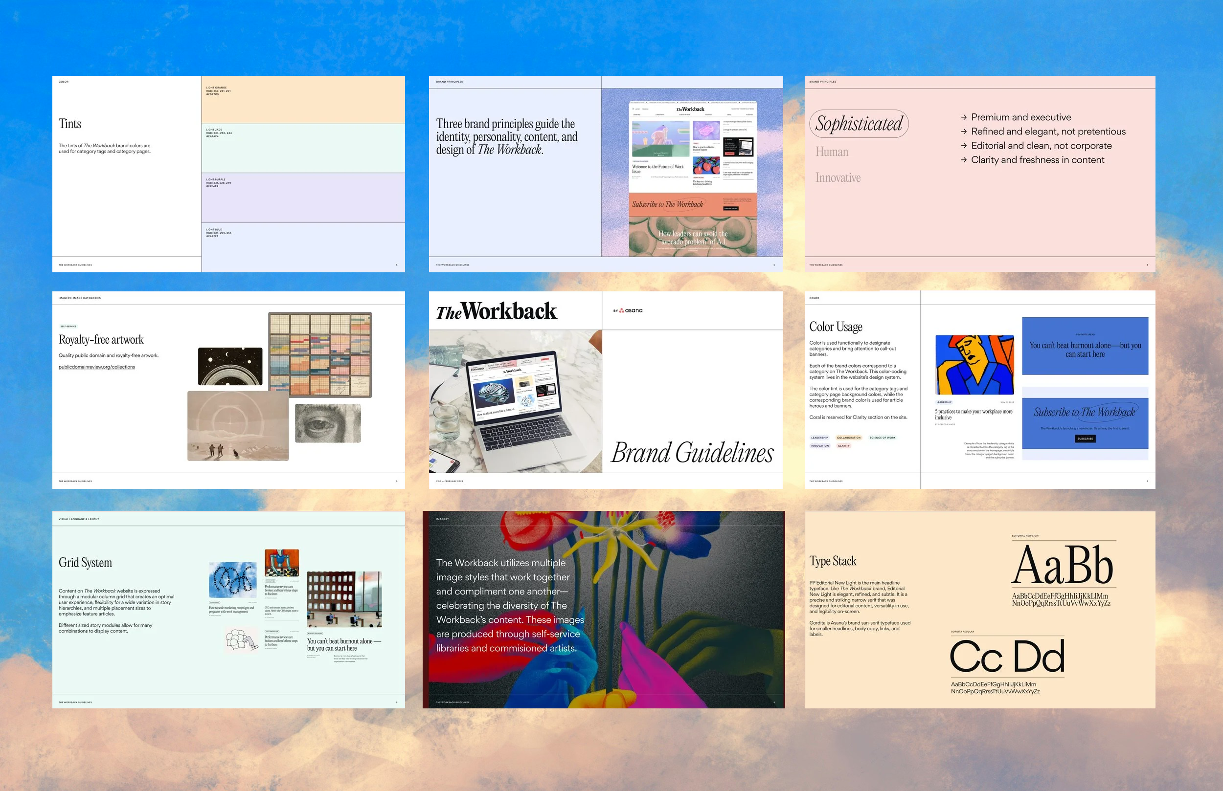
Intentionally create a brand agnostic digital publication as a distinctive sub-brand, sharing the essence of the same core brand and visual DNA while maintaining its own editorial and unique look and feel.
It was essential that the new site feel like a sophisticated and human-centric digital magazine, not an average uninspiring corporate blog. Looking to editorial powerhouses like The New Yorker for inspiration, I led the development of a differentiated and striking creative direction based on 4 design principles.
Sophisticated & Premium
Like Forbes or Harvard Business Review, but warmer and fresher. Takes inspiration from a traditional publications to evoke the trust of a long-standing, well respected institution infused with a more modern look & feel.
Innovative & Inspiring
Forward-facing and cutting edge research-driven content and imagery to cement our place as thought leaders on the constantly changing modern workplace.
Human & Thought-provoking
A typography-driven, utilitarian, and architectural approach that puts the reading experience first through a minimalist, but thoughtful storytelling-focused identity.
Bold
An ahead-of-trend, confident, and colorful visual design that is unique from Asana.com, but feels part of the brand family.

Defining a sub-brand
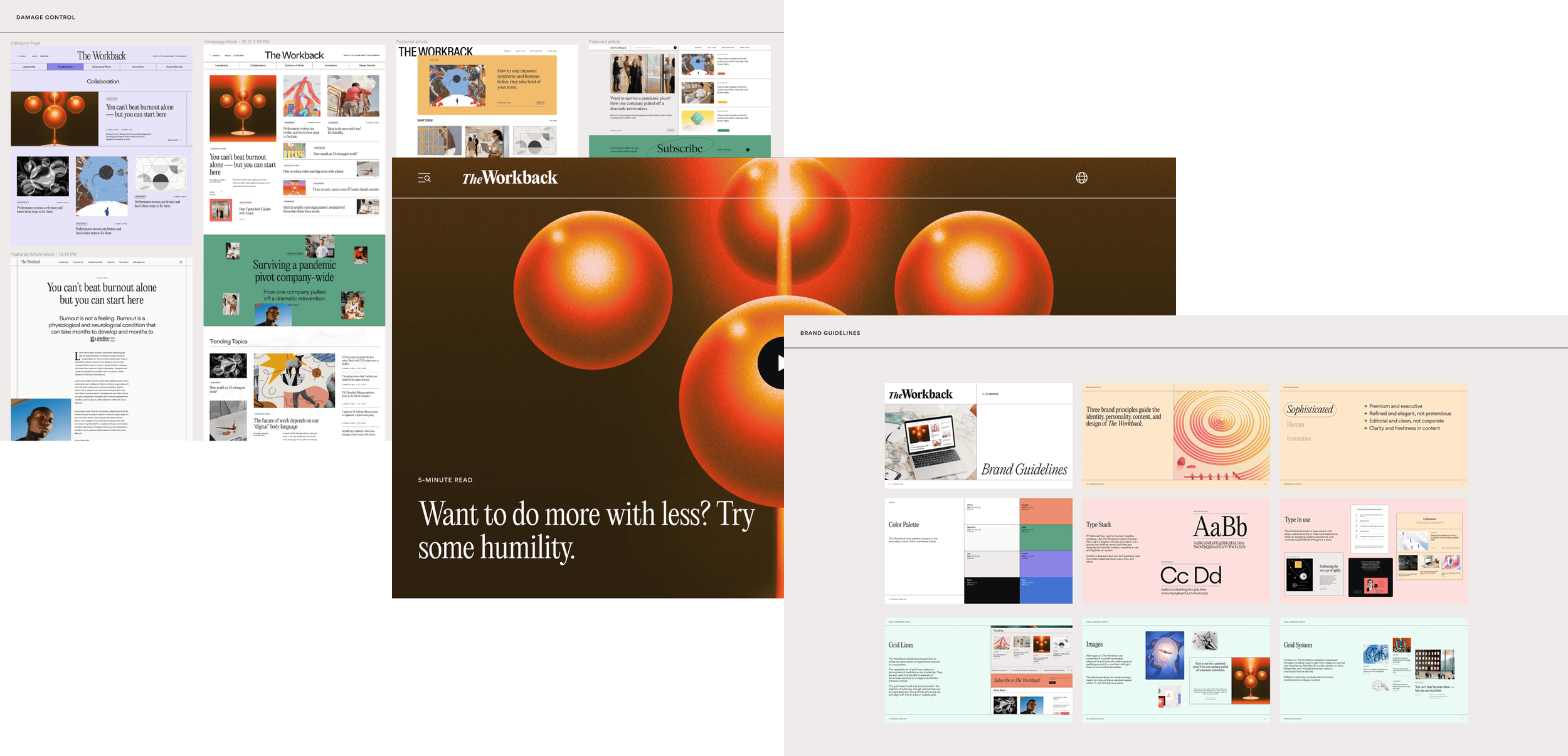
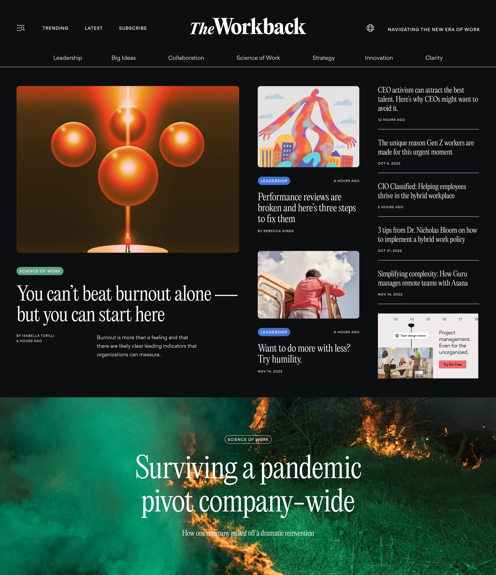
The type-forward editorial foundation of The Workback’s visual identity was crafted to make bold statements, foster an engaging reading experience, and cultivate visual interest throughout a story. We introduced a secondary serif to complement Asana’s primary sans serif typeface. We developed a flexible imagery system of illustration and art made in-house and by commissioned artists, cinematic photography, and data visualization to give the magazine a distinctive voice.
As design lead and art director, I co-created the brand direction and guidelines.
Building a new design system
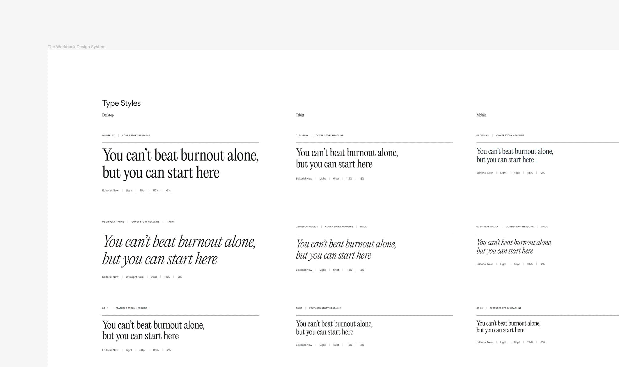
As the web designer on the project, I built the design system and designed responsive screens for each page type. The scalable design system included a component library, grids, type styles, color tokens, and UI and UX patterns.
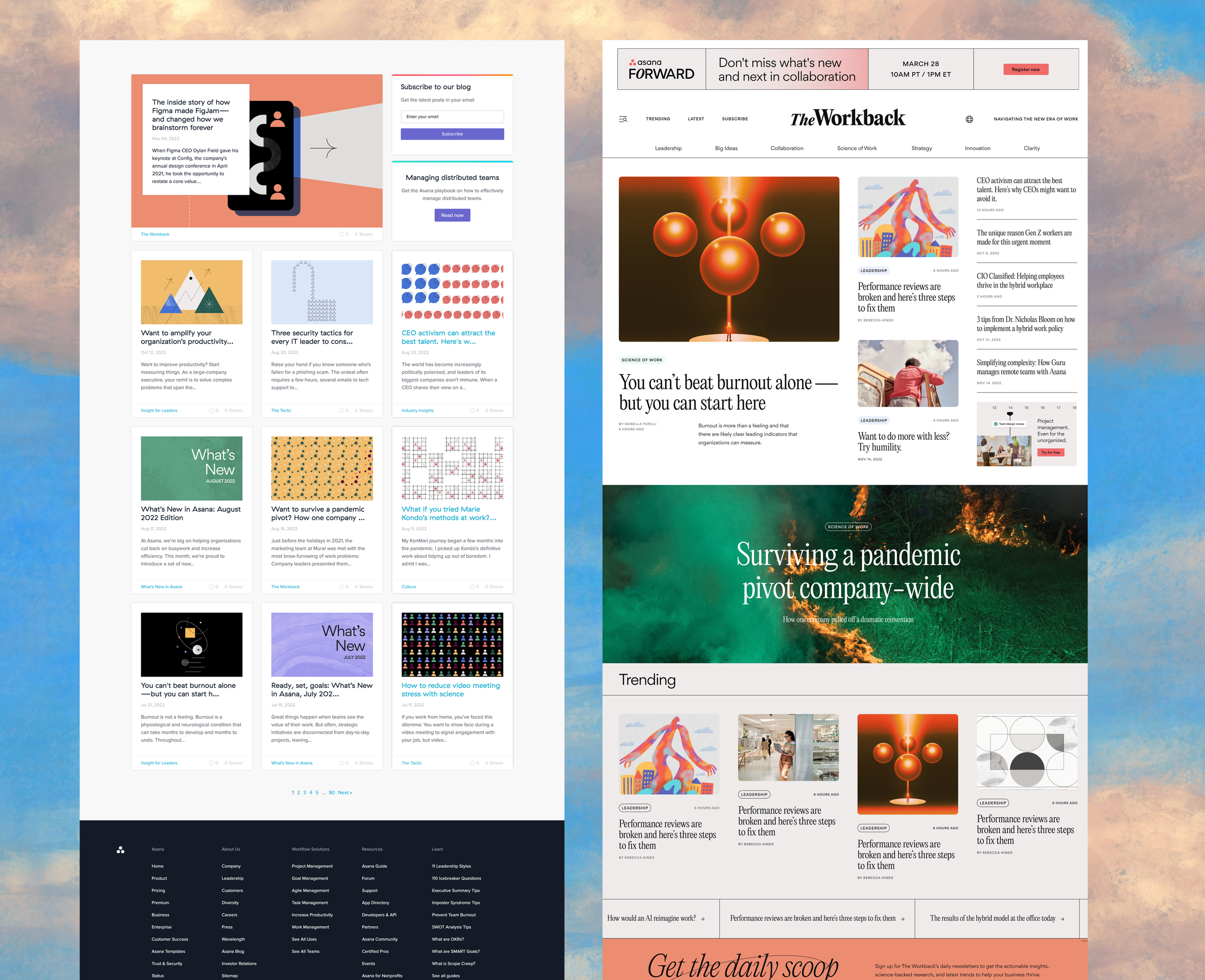
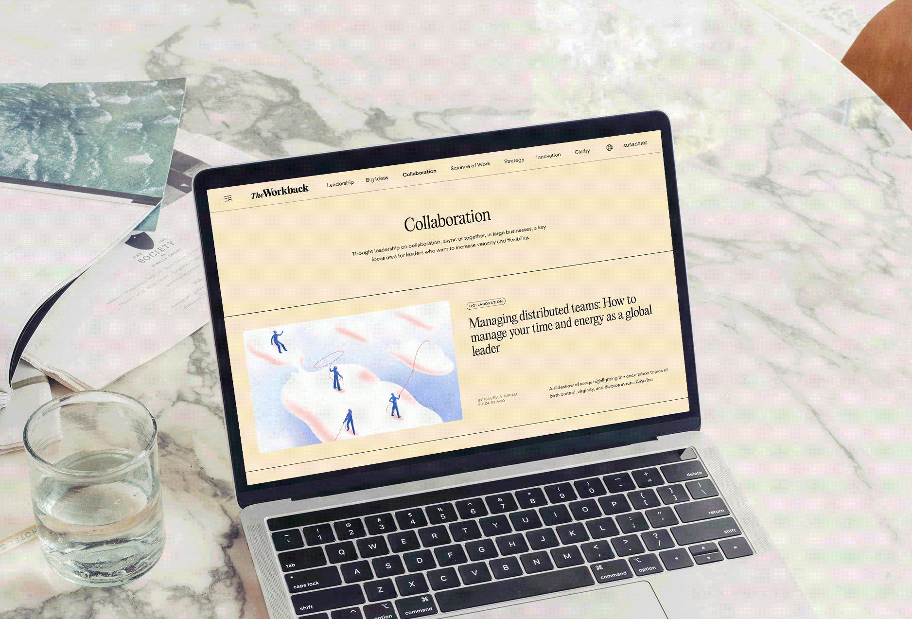
Creating a modular framework for content
Content on The Workback website is expressed through a modular column grid that creates an optimal user experience across all screens, allows for flexibility in story hierarchies, and guides the reader seamlessly through the content offerings.
The story modules were built on Wordpress to ensure our editorial team partners could independently set up new articles and digital issues while adhering to brand guidelines.
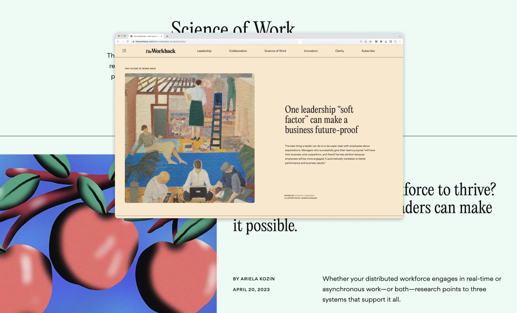
Different sized story modules allow for many combinations to display content. The homepage has the flexibility to stay fresh and exciting every month with each issue launch. Featured editorials can have unique design treatments.
THE RESULTS
40k
+16%
visitors in 2 weeks after launch
visitor lift over old blog

5%
newsletter signup CTR